Kevin Shaw is paid to know what good drinks design looks like. It’s what has made his agency, Stranger & Stranger, arguably the most coveted drinks design agency in the world. It also means he can pick out the crap, the slap dash and the kinds of design to bring him out in a cold sweat.
F***, marry, kill.
You know the game, the middle one is always the hardest and the other two surprisingly easy. Well not today.
I have to play this game every day, it’s an occupational hazard, we look for brands we want to kill and create brands consumers want to marry. Or at least have a real good walk-of-shame kind of night with. Well, last week I judged a design competition – 1,470 entries – and I got to play the game all day long. And that is when I fell in love. Dogs, kids, holidays, everything.
Wish I’d done it. There, I’ve said it. Thought it would stick in my throat but, you know what, it came out ok and felt… not good, no definitely not good, but nothing that a bit of self-flagellation won’t put right.
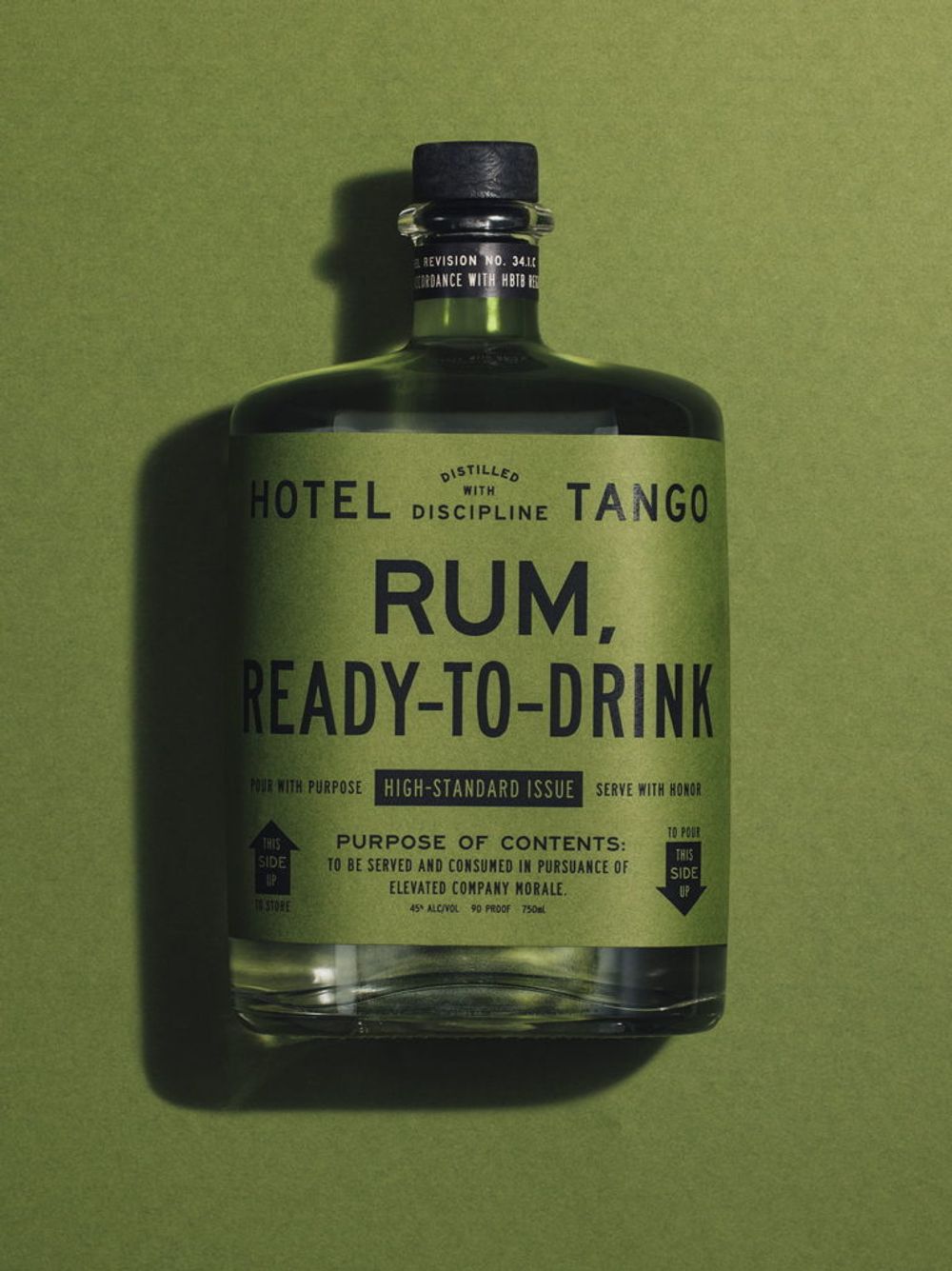
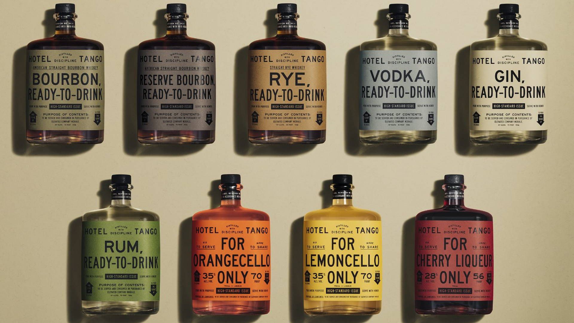
Kevin Shaw was blown away by the originality yet simplicity of the designs for Hotel Tango drinks by Young & Laromore
The wish I’d done it story: a combat injured vet and his wife open a distillery. Hillary and Travis, HT, Hotel Tango in Nato phonetics. Nice name! And the branding, lifted from military ration packs, is perfect. Just perfect. Strong in a thousand yard stare kind of way, so inexpensive to produce that it’ll be copied by military coups everywhere, versatile, colourful and totally iconic. The single best use of typography all year and just stunning. Hats off, kudos, a warm round of applause, and a big shout out to the agency Young & Laramore. I doff my cap to thee.
Now for the killing. After that I definitely need to kill something.
There’s something spreading out there. No, I’m not talking about that, I’m talking about minimalism. It’s the new thing. The fad. Shortened from fiddle-faddle or perhaps from French fadaise ‘trifle, nonsense’, the word’s been around since the 19th century, so clearly not a fad. Minimalism, on the other hand, started in the 50’s, rears its head every 20 years or so, and it’s back.
I’m starting to see outbreaks everywhere but it seems particularly prevalent in the beverage industry – sodas, CBD concoctions, beer – and you can spot it a mile off because one of the main side effects appears to be a wash of desaturated colour. Think pastel coloured paint chips.
Can you imagine if everyone catches it? It’s a terrifying thought. Pastel coloured wine labels with just the varietal in san serif, ranged left. Pastel clad sales people smiling pastel smiles and pointing you down pastel rows of pastel products. Shallow brands in shallow colours. Like being trapped in Barbie’s drugstore while your soul is being sucked out by a baby blue dementor.
Pastel colours might work in your bedroom, but please not on the side of a drinks can or a bottle, says Shaw
You know why minimalism is so easy to catch, why you should always be careful around people with minimalism? Because it is mind numbingly easy to design like this. You know in the movies when the zombie just stands there banging their head against the wall? Well, imagine a designer zombie, banging their head against the keyboard. This is what spews out.
Most of these designs are available as templates so you don’t even have to think or research or engage with anyone. Your copy goes here, the template says, so you could literally phone it in. You could write a program to do it. So I tried my six year old on it and gave her a template. I think she’s the smartest, most creative and beautiful thing in the world. She’s so not, she couldn’t spell a varietal to save her rabbit, but she picked the colours and knocked out a brace of minimalist wine labels from a template and it took her less than an hour. These designers must be calling it a day at 10am! I then, just to be safe, scrubbed her eyeballs and set fire to my mouse.
There’s a phrase, two words, that I really don’t like hearing. I understand why the phrase exists, some people need it to survive, but I hate it anyway: value engineer. We’ve been a victim of value engineering on more than one occasion and we’ve had to adapt our design to cheaper glass or fewer print embellishments, even fewer colours. I get it, the COGS need to make sense, but there’s a difference between simpler and more simplistic.
Minimalism is value engineered thinking. A lavender lobotomy. Just pretty and meaningless swatches that could go on any product in any sector; paint, baby food, laxatives, anything.
Stories are important for us human beings, we’ve been painting them on cave walls ever since we had cave walls, and minimalism says nothing except a colour for the baby’s room. Which reminds me, Hemingway apparently won a minimal story competition once with six words: ‘For Sale: Baby shoes, never worn’. Luckily The Old Man and the Sea had a little more to it than ‘Caught big fish, shark ate it.’.
Designer zombies! Run. Three words.