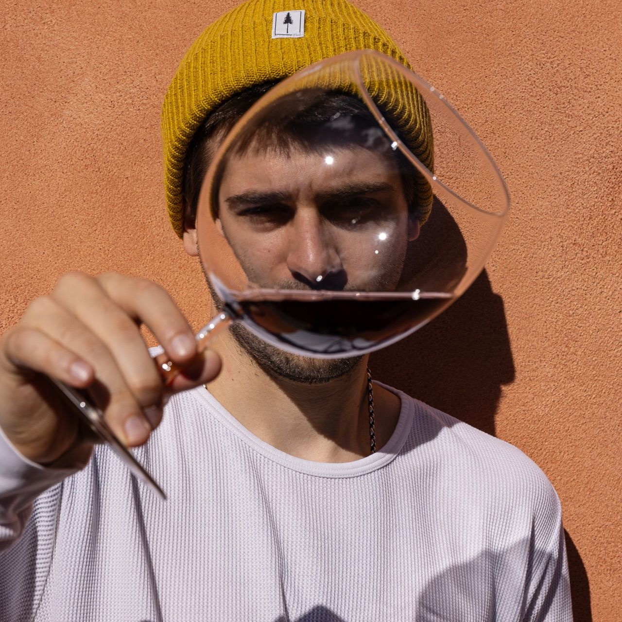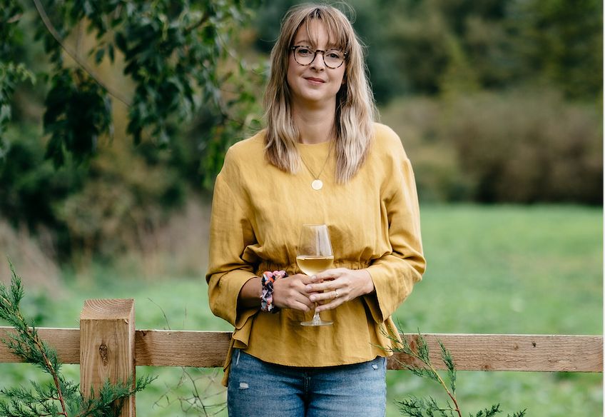
Jodie Newman has enjoyed a hugely rewarding and varied career heading up design at Freixenet Copestick but is now ready to take her skills and experience to work directly with producers and customers wherever they may come in the world with her new design agency, appropriately called Jodie Newman Design.
Can you tell us about your background and how you got into creative and graphic design?
Coming from a family of artists (my grandmother was a pattern designer at Liberty) I’ve always had a natural affinity for drawing, painting and lettering, which lead me to a Graphic Communication with Typography degree at Plymouth University. From there, I got my first job in the big, glamorous world of design, the brief… a slug pellet logo.
What is it about design that you find so interesting?
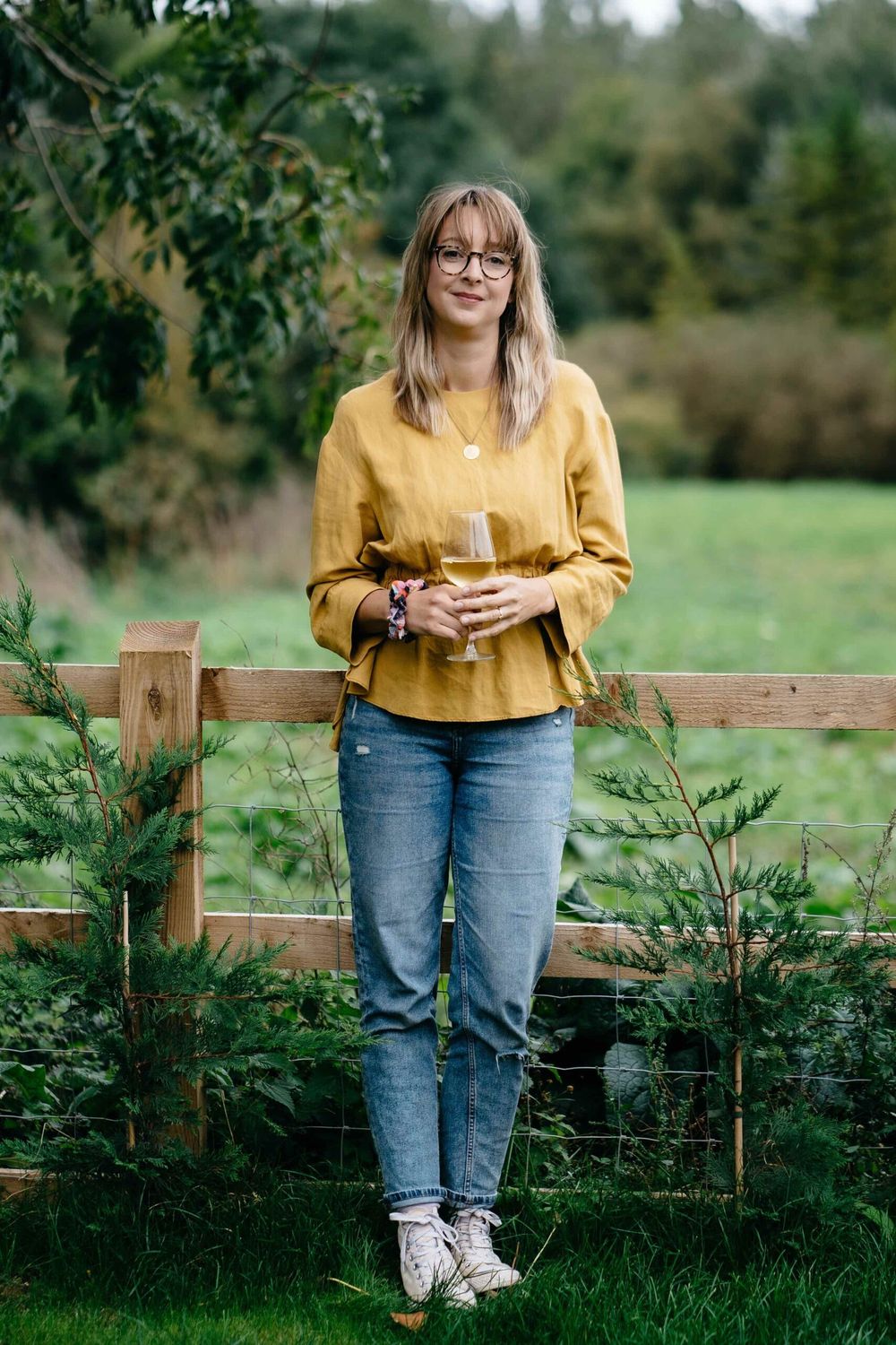
Jodie Newman is looking forward to working for herself and customers on a one to one basis
I love a clear vision and a sense of invention, the ability to turn simple shapes and formations into coherent, engaging aesthetics.
Seeing a brand grow and develop, emerge from some rough sketches and bringing clients ideas to life though visual storytelling will always excite me. Design is essentially visual problem solving, using colours and forms to communicate messages.
How did you get into the drinks industry?
I was working at Trailfinders on High Street Kensington (mainly laying out type for travel brochures and photoshopping clouds out of sunny beach pictures) when I came across a posting for a label designer at Barlow & Co. I’ve always loved wine, and was taken by the notion of using bottle labels as tiny canvases. It was the perfect way to combine my love of typography with my illustration skills.
What did you learn most from your time at Barlow & Co?
Abi (Barlow) was crucial to my development as a label designer. I had a keen eye for type, and strong story-telling and conceptual skills, but she taught me how to balance a wine label and to understand the viewers connection with it. My knowledge of print production, papers and finishes rocketed during this time. She also set me up on a WSET course, through which I gained a deeper understanding on the wonderful world of wine.
What were some of the projects you enjoyed working on the most at Barlow & Co and why?
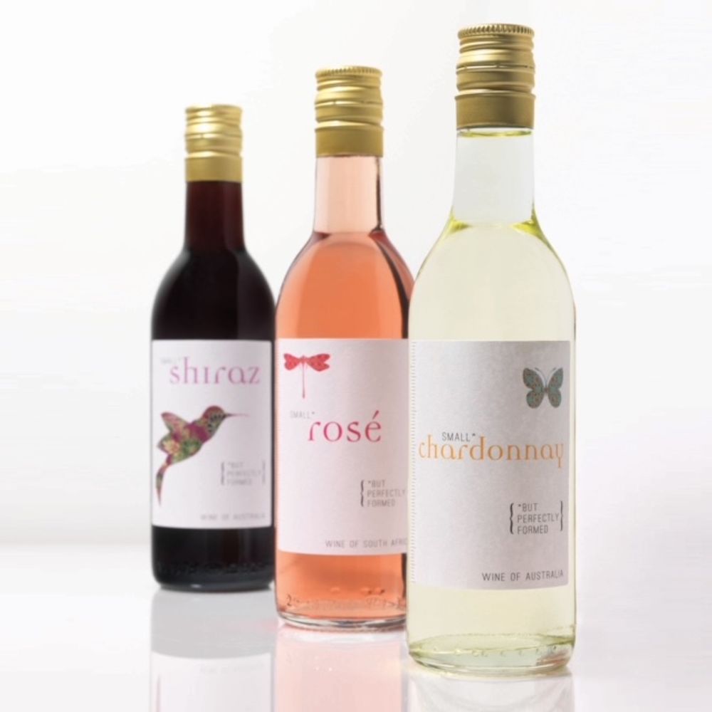
‘Small but perfectly formed’ was the award winning design that Newman helped create whilst at Barlow & Co
I am very proud of a series of labels we developed called “Small but perfectly formed” – a range of 187ml mini’s that celebrated all things teeny (each label featuring a true to size animal illustration) We won a Drinks Business Award the year it was launched for “Best Design & Packaging”.
I also designed a label for Jamie Oliver’s restaurants when they first opened in London – an exciting moment and my first on-trade wine label.
You have been heading up the creative design side at Freixenet Copestick – what did that involve and give us some examples of some of the key projects you worked on?
For the last seven years I’ve helped grow the company’s in-house brands including i Heart Wines, Mionetto and Freixenet, both through NPD but also graphics for advertising, point of sale and social media.
The role involved an in depth understanding of the wine category, from wine label trends, designing new brands, wine labels for bulk models from scratch, to art-woking, label print production, creating mock-ups brand guidelines and everything in-between.
Two stand out projects for me during my time at FXC include the recent I Heart Superheroes campaign, an online and social campaign to celebrate and say a “massive thank you” to our NHS heroes during the pandemic. We surprised 2,500 nominees with a well earned bottle of Prosecco.
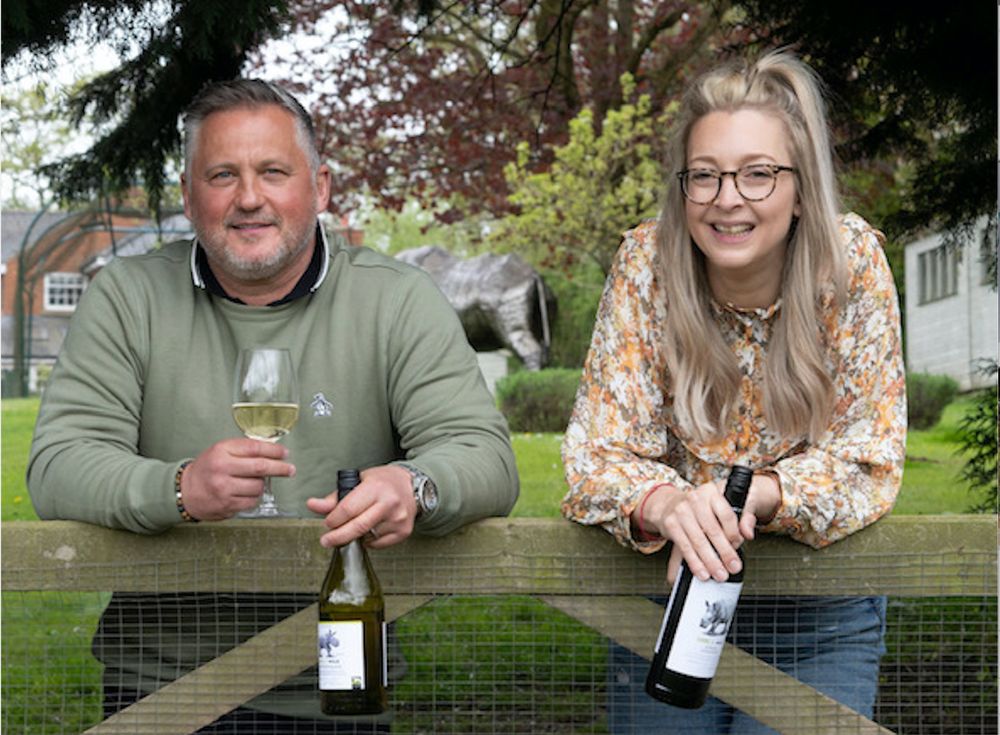
Jodie Newman was part of the Freixenet Copestick team that worked with former cricketer, Darren Gough, to create the bespoke Care for Wild wine range to help raise money and protect and save endangered rhinos in Africa
I also recently (whilst in lockdown and homeschooling two kids) successfully helped create the designs for “Care For Wild” a new South African wine brand helping to save and raise money for endangered rhino, alongside former England cricketer Darren Gough, the ambassador for the Care for Wild charity .
What did you find most rewarding in your role there?
I enjoyed the freedom to develop as a designer and creative director and work with such an innovative (and fun) group of people. i Heart Wines celebrates its tenth birthday this summer and it’s been a real pleasure to help sculpt such a successful and brave brand. Another mega highlight was working with Sir John Hegarty – the advertising genius and a pioneer for driving innovation and culturally relevant work.
When you are working on a new design or label what do you need to know from the business in order to then transform that into a winning design?
I ask for lots of information about the wine; the style, the abv, the format (size of the bottle or can), the name (if a name doesn’t exist I will make some suggestions). I like to start with a super loose pencil sketch, this helps me imagine the composition and tell the story. Story is key – consumers need a hook, something that makes your label different to all the others, something for them to remember you by.
You are now setting up on your own – JodieNewmanDesign.com – why are you making that move at this stage in your career?
Jodie Newman design portfolio stretches outside drinks brands into retail and health and beauty and other consumer goods areas
Creative freedom. Breaking out on my own will not only allow me to approach my work with a more personal touch, but also help me form deeper connections with the people I work with and the projects I work on. Wine has been my professional life for eleven years now, and while I don’t want to leave it behind, I do want to refresh my perspective.
What services and support do you hope to offer business?
I’m hoping to continue to work on brand strategy and package design for wine – my area of expertise. However, I’m also looking to offer strategic marketing, website and digital design and eventually events planning. I want to work for passionate people who aren’t afraid to be bold and make a difference.
What do you hope can be your point of difference?
I deliver creative work with substance and purpose, prioritising depth and emotive imagery over flashiness. I still retain my appetite for “The New” – new discoveries, trends and print techniques. It is this combination of experience and boldness that drives me to create fresh designs that not only capture the essence of the product but set it apart from the competition.
How do you go about creating a design that is going to stand out on the wall of wine in a supermarket?
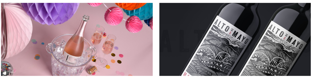
Examples of work she did for Freixenet Copestick aimed at the mass wine consumer
It’s important to research and understand both the current market and your competitors, but ultimately the wine needs to look authentic, tell a story and make the consumer pick it up – getting it into their hands is half the battle.
Do you approach a design any differently if it is be sold in the on-trade?
On-trade labels tend to be more detailed, less branded, and possibly more interesting to look at. On shelf it’s all about speaking to the consumer – they want to see the varietal, first and foremost (this is what set i Hearts Wines’ labels apart, we took the one thing consumers are confident about when buying wine, the varietal; and made it the biggest, boldest part of the label – the branding took a back seat).
What changes have you seen in your career to how the wine sector now regards design and packaging?
While sustainability is the word of the moment, it will remain a green washing buzzword until the wine industry makes fundamental changes to packaging and labelling. It’s great to see cans and BIB’s gain momentum, but brands will need to convey their sustainable message in emotive, engaging ways if they are to overcome the industry’s fixation on the bottle.
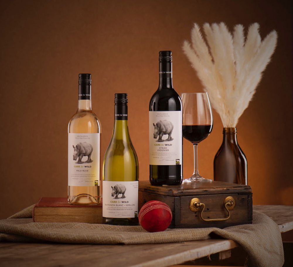
Newman is particularly proud of the work needed to pull together the Care for Wild range together in a limited period of time
What are the most challenging design briefs?
Copy-cats. In the industry we call them “me too” labels. For example, “a brand with misty mountains is selling well, let’s all do labels with misty mountains on.”Ummm, no, let’s not.
What wine label designs that other agencies have done that you most admire or wish you had the chance to work on that project and why?
I love the work of Denomination. Their “Tread Softly” label is design perfection. I’d love to have the chance to collaborate with them one day. I’ve also been hugely inspired over the years by Stranger & Stranger and its wine and spirits portfolio of designs. There are too many to mention but its “Kraken” design is an absolute classic.
How do people get in touch with you if they have projects they would like you to work on?
My website: www.jodienewmandesign.com has a contact page and shows a selection of my recent design projects and Instagram for more design based ramblings at @jodienewman_design.